Eggers Hops’ existing logo successfully conveyed the hops’ New Zealand origin through a ‘hop kiwi’. But it wasn’t enough to convey the product’s promise—exceptional hops grown by generations to make outstanding beer for their worldwide clientele.
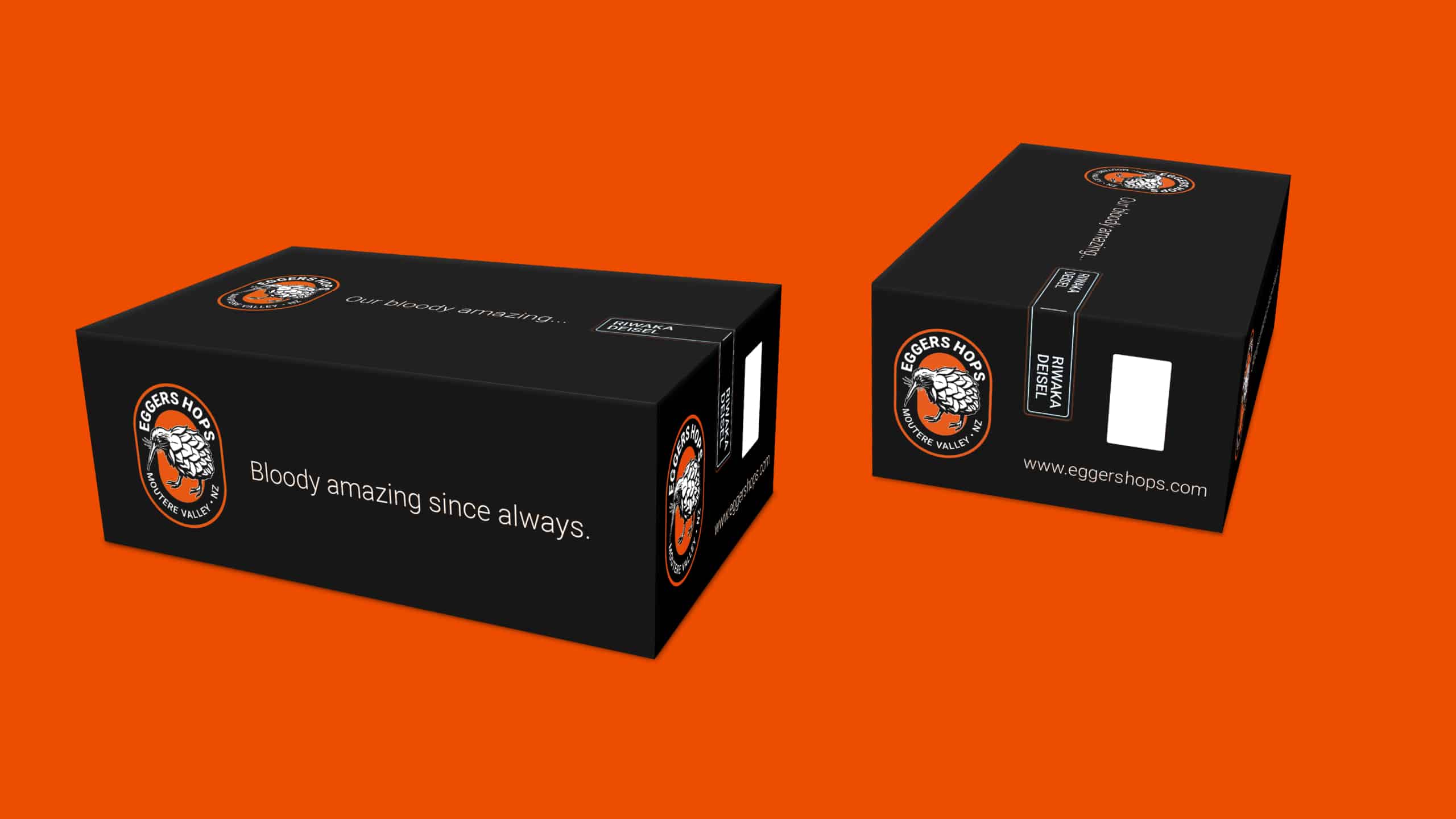
Jane used a classic beer label shape for the logo, which immediately ties it to the end product, and replaced the old font—traditionally used by stone masons for tombstones! The client was adamant about the use of orange—not a problem from Jane’s point of view as it exudes positivity and radiates happiness, a great combination that meets the needs of the end-user!
Lastly, the tagline conveyed quality and longevity—“Bloody awesome since always.” It was a little cheeky but on-brand! It even lent itself to being flexible when it came to the packaging of different varietals—“Our blooding awesome… (Insert varietal label here).”
While the changes weren’t a massive leap in that the hop-kiwi is still the vocal point, the brand is elevated 10-fold in its promise of a bloody awesome beer at the end of the day.